
Our Logo
Our logo is displayed on a white backdrop whenever possible. Do not tilt, add to it or alter it any way.
Logo Use Guidelines
Construction
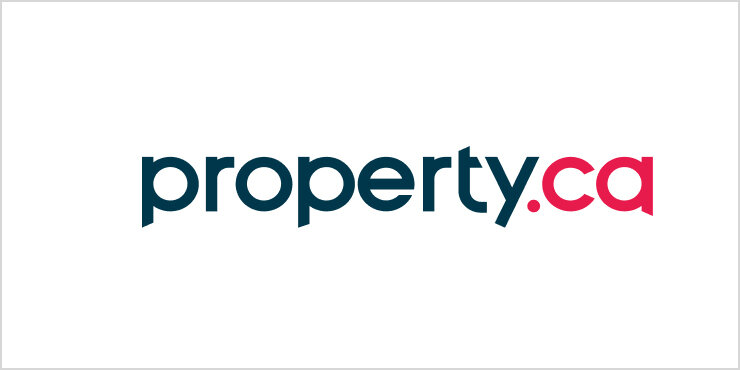
Our logo is designed to have identifiable features, while still being legible, no matter the size. Proper balance, weight, and use of clear space make it easy to recognize our brand in any size or context.
The centre of attention is achieved by cuts applied on individual letters at 25 degrees in opposite directions.
Clear Space
Edges around the logo are minimal, with no other graphic features breaching the space. Edges are laid out in a circle that acts as the starting point from which each letter is built.
Scale
Scale and proportion are characterized by the available area, creative choices, activity, and clarity.
When using logos for web functions, use predetermined sizes : they have been developed to enhance visual clarity and decrease sub-pixel rendering.
Primary Logo Colours
Our principal brand and logo colours are magenta and blue. Magenta is a powerful colour that evokes innovation and the energy and pace of real estate. Blue complements the red, communicating the stability, support and security of the trusting relationships we build with our clients. Use brand colours consistently.
The magenta and blue colour scheme can be used in the backdrop of any material that has a reverse white logo. The brand colours are equally represented and appear with full resonance. The colours cannot be altered through lighting or transparency.

Magenta
HEX: #e8194b
RGB: 232, 25, 75
CMYK: 2, 100, 65, 0

Blue
HEX: #07364b
RGB: 7, 54, 75
CMYK: 97, 72, 48, 43
As an alternative, you can use the logotype against the magenta brand colour.

As another alternative, you can use the logotype against the blue brand colour.
The most effective way to use the logotype on a white background.
The most effective way to use the logotype on a black background.
Layout Positioning
Indicate importance through size and layout. Ensure the scale of the text in the brand logo makes it easily recognizable. Do not place it in the centre of the design. And when the logo accompanies copy, align left or right.
Layout
The Property.ca Inc. Brokerage logo should be showcased prominently against the backdrop. Do not place design features with similar colours behind the logo, and ensure the background has no extra elements or structures to distract the eye. If the design is meant to be viewed from far away, make sure the logo is visible and easily recognizable.
The logo can be used horizontally and vertically in the layout. The ideal location is the top left corner (horizontal) and top right corner (vertical). It should always be prominent and not covered by any other elements. The background space must be full tone to highlight the typography.
Horizontal

Vertical

Symbol
The minimum size for a logo symbol is 32px x 32px. When used in applications like email signatures, Slack, Humi, and social media, the optimal size is 96px x 96px.
Favicon
If a favicon is required, use the style pictured above. If it needs to be bigger, increase the scale by doubles only (ie. 16px x 16px, 32px x 32px, 64px x 64px).
Property.ca Inc. Technology Brands
Property.ca, condos.ca and mrloft.ca are technology sub-brands of Property.ca Inc. Referencing them creates alignment with our overall brand and showcases our areas of specialization. For examples of how the technology brands should be applied visually, refer to our main visual identity page.
Logo Applications
Digital Media
Use SVG files (PNG or JPG files can be used if SVG is not available). The logo should always be clearly visible and remain uncovered by any other elements.

Print Media
All print applications should be vector logo files (300 dpi PNG and JPG files can be used if vector files are not available). The logo should always be clearly visible and remain uncovered by any other elements.

Business Cards
Option 1: Standard

Option 2: Headshot

Option 3: Headshot

Option 4: Headshot

Option 5: Agent Branded

Teams & Brand Affiliates
Our logo may be used beside the logos of our internal teams. It should be positioned to the left of the team logo and scaled larger for easy recognition.

Logo no-nos
Do not change size, shape, background or font colours in the logo.
